
I considered naming this article “what are you thinking!” or possibly “are you stuck in the 90s?” or any number of other abrasive titles asking “why your website has not been updated to a mobile friendly website”, but I realize that most of my future customers are already extremely busy with the day to day tasks of running their businesses and are not able to have the vantage point that I do.
What is a mobile friendly website?
Quite simply a mobile friendly website is one that is easily viewed from a mobile device. There are a number of reasons, that I will get into in a minute, that explain why this is a big deal for your business.
Prior to the arrival of tablets and smartphones a website only needed to be able to be viewed easily on a desktop or laptop computer, which is usually between 800-1200 pixels wide. Once a smartphone and tablet user started to be able to view websites on their smaller screens technology needed to keep up to adjust the websites to match the screen size. A smartphone screen width is usually around 300-400 pixels wide and a tablet is 600-800 pixels wide.
The first way this was achieved was by making a second “mobile website” to match the larger primary website. You can still see these websites as you search. There is a “m” before the website name like this https://m.facebook.com/home.php.
The current method for making a mobile friendly website is called a “responsive design”. This is a website that has been designed to adjust to the screen size that it is being viewed on. This way only a single website needs to be built and it will automatically adjust based on the screen size of the device that is being used. This is how we build websites at Three Strands Marketing.
There are a couple of tools that you can use to check for yourself whether your website is able to be viewed on a smart phone. Google offers one on their developer tools here, and you can also see what your website looks like on multiple devices by going here to Responsinator.
Benefits of a Mobile Friendly Website
-
Google gives preference to Mobile websites
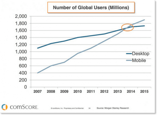
To those of us in the web design and internet marketing world, we had our lightbulb moment back in early 2015. At that time search engine land posted an article where Google confirmed that more searches were happening on smart phones than were happening on a desktop.
On April 21, 2015 Google applied an update to their search results which actually gave a preference to a website if it was mobile friendly. This update became known as “Mobilegeddon” and Google openly announced that if your website was not mobile friendly it would have an adverse effect on your search results rankings.
Here’s a link to a CNN article that aired on April 20th, 2015:
-
There are more smart phone users than ever because they are now more affordable than ever
The Pew Research Center in October of 2015 stated : “68% of U.S. adults have a smartphone, up from 35% in 2011, and tablet computer ownership has edged up to 45% among adults, according to newly released survey data from the Pew Research Center.”
-
An improved user experience (content visibility)
Your customers are able to clearly see your website content when your website is mobile friendly. No more “pinching” the screen to get it large enough to be able to be easily read or swiping the screen up/down and side to side to be able to read the website.
-
Lower bounce rate (techy for attention span)
It has been a well-known fact for a long time that a high bounce rate will also have an adverse effect on your search result rankings.
Bounce Rate is simply a calculation of what percentage of visitors come to your website and then “bounce” right off of it without clicking through or staying on the page for a while. Google defines it here.
-
Better visible brand identity
 This one is kind of obvious, but if the website images are so small that they are hard to see, it will be hard to promote your “brand”.
A mobile friendly website allows for the image to be large enough in the header of your website that it is clearly visible, which helps to promote your personal business brand.
-
Gives your business a competitive advantage
How many of your business competitors have a “mobile friendly” website? If you know that Google penalizes websites that are not mobile friendly, just having one when your competitors don’t will give the competitive advantage on the internet.
On the flip side, if their websites are already mobile friendly and yours isn’t, then in order to even the playing field you need to be mobile friendly.
-
Website Page Load Speed
Have you ever sat and waited for a website to load only to click back when it seems like it taking forever? This is another one of the Google ranking factors that most small business owners are not even aware of.
Google will promote a fast website and demote a slow website. Googles ultimate goal is to return in the search results to its customers the best websites based on their query. They know that people will bounce more frequently on a slow loading website, so they have made adjustments in the results to account for this factor.
A mobile responsive website is designed for speed. When we build a website we make sure to optimize the images and other factors to improve the page load speed.
-
Visible “calls to action”
Smartphones give the users the ability to click on a phone number or email right on the screen. The text is large enough that it is clearly visible and they are able to call or email your business with a tap of the smartphone screen.
Additionally, if your business offers its customers the option to purchase your goods or services on your website, a responsive website will improve their ability to order from you.
-
Localization (Smartphone used with GPS)
 One of the most frequent search modifiers in Google is “near me”. Many people will search for a “restaurant near me” or “electrician near me” or other near me type of search.
A smartphone is able to determine your actual location and let Google know where you are so that they give you search results that are actually near you.
If your business is one that a customer would be looking for in close proximity, why would you want your competition, that is further away, to be getting these calls?
-
Compatible with all platforms, unlike an app.
One alternative to a mobile responsive website is to have an app that performs a similar function. This can be a very time consuming and expensive task but even more challenging is to make sure that the app works across all platforms. Then you have to get the app approved by each respective platform.
Why not just have a great website that looks good on all of the devices to promote your business!
Even today I am amazed as I drive around my local community and take note of the websites that are displayed on company vehicles, billboards or other public signage how frequently these websites are not able to be viewed from my smart phone.
Keep in Mind the Objectives of a Mobile User
A mobile device user wants a website that can be a) viewed easily from their phone b) a website that loads quickly and c) one that they can call, email or get directions to with the touch of a button. And as you may already know, many younger smartphone users are choosing to use their smartphones as their only way to access the internet.
When these users come across a website that has not be designed with their needs in mind they are quick to leave and find a business that does.
In order to reach these customers you need a mobile friendly website and working with an experienced web design and digital marketing partner, like Three Strands Marketing, is your most effective way to achieve this!
